Voltelligent – Web App
Voltelligent – Web App
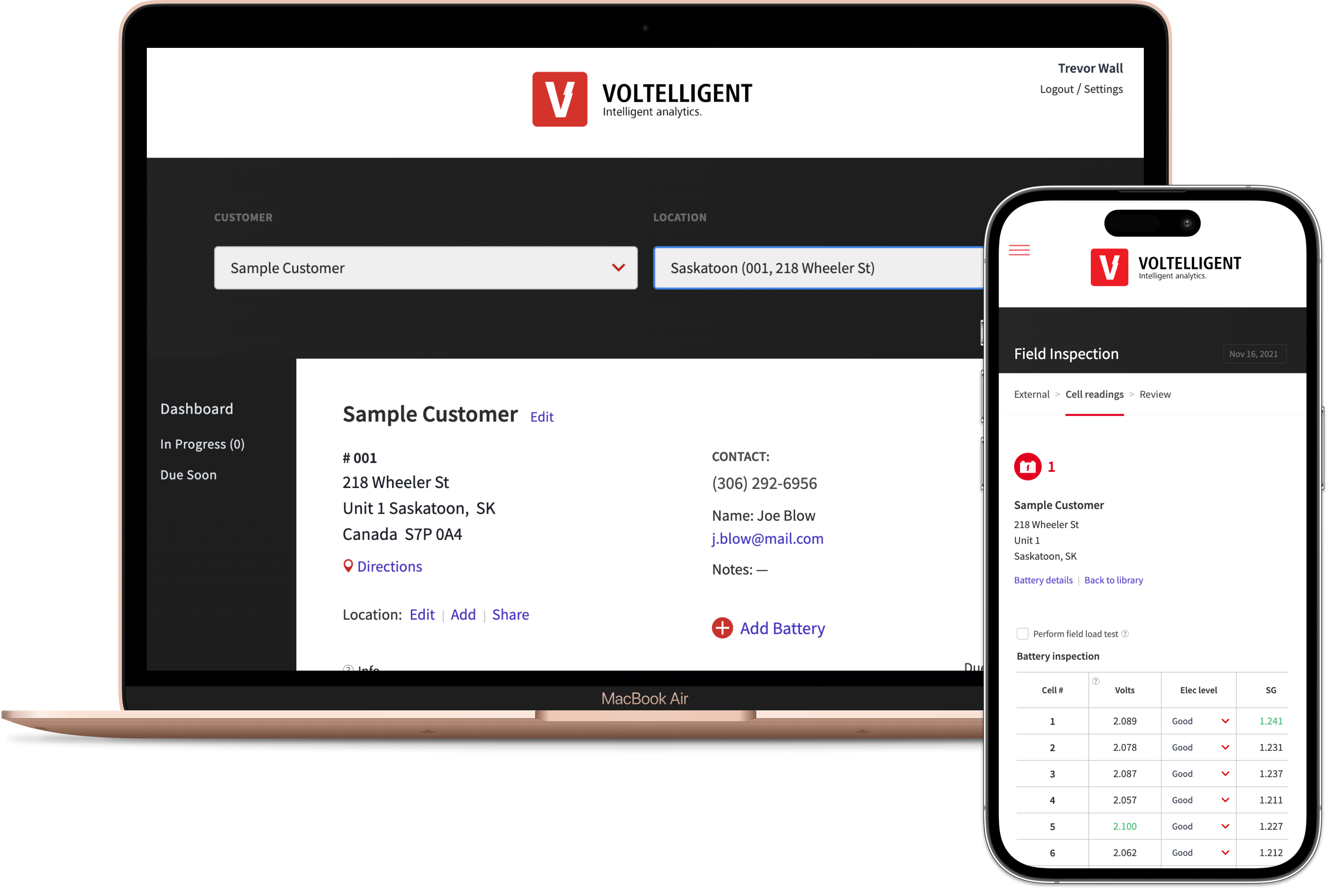
Create an easy-to-use web application that allows battery technicians to collect data in a consistent way.
Features include an at-a-glance assessment that can be sent to the customers, ability to move batteries to different trucks, replace cells or batteries, delete, archive and add custom makes, models etc… There is a lot going on but it is all captured in a clean, easy-to-use interface. This is a great example of having to simplify things so they are digestible and easy to find.
Some of the problems and solutions are highlighted below.
My role
Project Management, UX Design, UI Design, Front-end Development
Tools
Adobe XD, Photoshop, Illustrator, VS Code, Gitlab, Vue.js, Vuelidate, GraphQL, Tailwind CSS, Trello
Year
2021
Skillfully acting between founder/inventor and the software developer, Trevor designed a user experience and interface that was logical, clean and seamless. We are so very pleased with the product. Trevor moved us through decisions, sticking points, and inevitable improvements “on the fly” capably and calmly. A true professional. Highly recommend.
Dani vanDriel, Owner Action Battery Service, Co-Founder Voltelligent Analytics Inc.
Problem 1
How can we define the users and their tasks?
Solution: The client has a company that services batteries so we had a good idea of who the users would be. User stories were created to capture all of the tasks a user would perform. Example. As a technician I will perform an inspection so I can collect current data on a battery. This would serve as a starting point to define the different users and their tasks.
Below are the three main users and their pain points.
Problem 2
The fields displayed need to change based on the battery configuration.
Solution: Filter the fields that are displayed based on the battery configuration. With almost 200 different variations we needed to start broad and narrow things down from there. Asking if a battery was flooded or sealed, 2,6,8 or 12 volt and the number of batteries or cells was a good place to start. This would determine what fields a user would see while adding a battery as well as within an inspection.
The app was tested internally for almost a year. During that time updates were made based on issues that would arise. There was really no way to test this until it was a fully functional app being used in a real-world situations.
Problem 3
The batteries need to be physically removed in order to inspect them. If a technician doesn’t do things in the correct order a step could be missed.
Solution: Setup the inspection so that it can be followed step-by-step, allowing technicians to collect all of the necessary data in a logical, efficient order. The process was developed by the creator of the app, someone who has performed thousands of inspections.
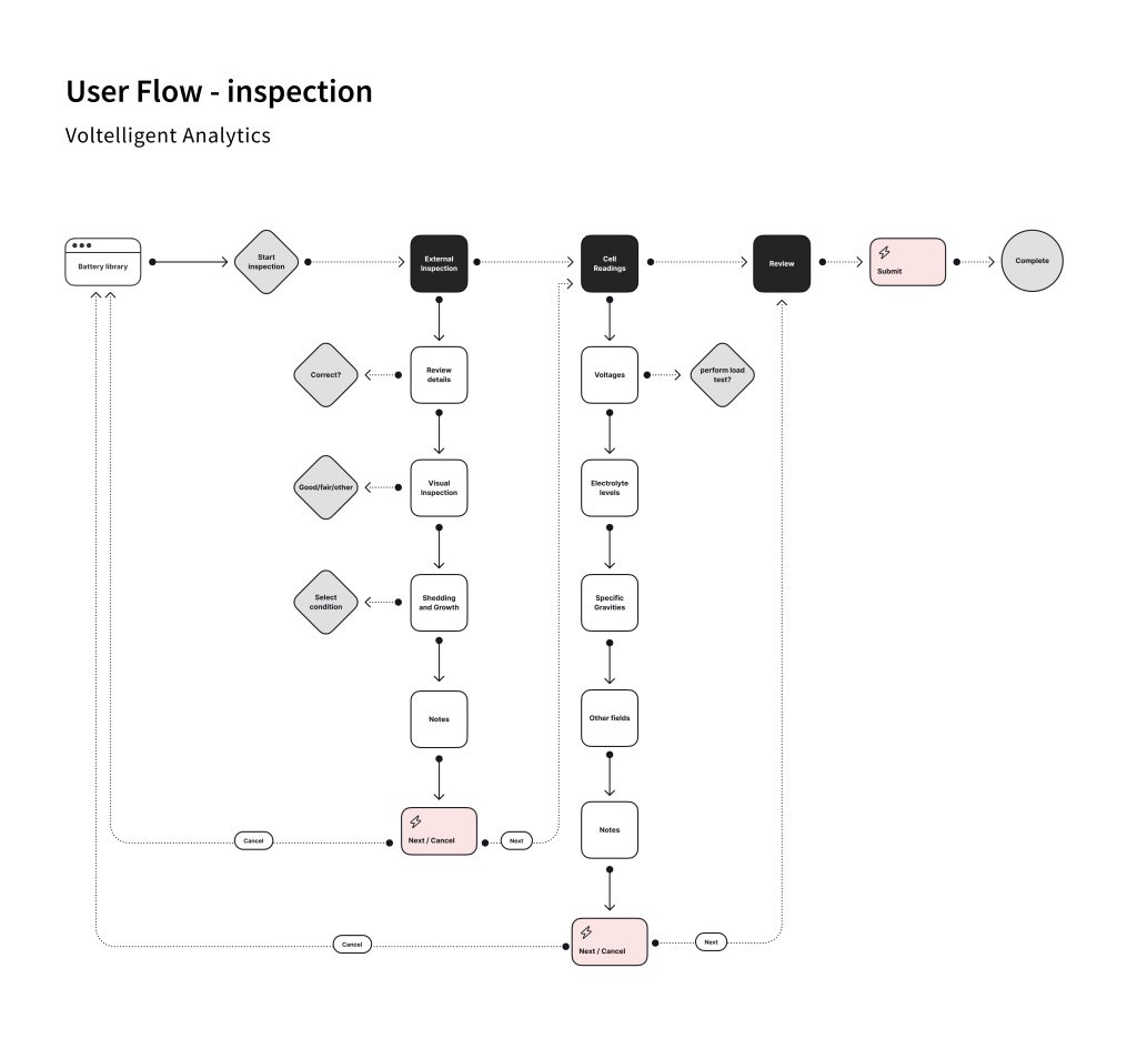
Here is the user flow in action (same applies to new inspection)
We tested less experienced technicians to see how they would do following the process, watching for any issues along the way.
Problem 4
Techs entering incorrect data
Solution: Add validation to every field so only the proper data can be entered. Warnings and alerts prompt you if something is missed or incorrect. This was a big part of the project. Proper data entry was crucial so the charts could be properly generated.
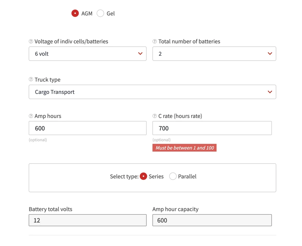
Required fields and descriptive error messages ensure proper data entry.
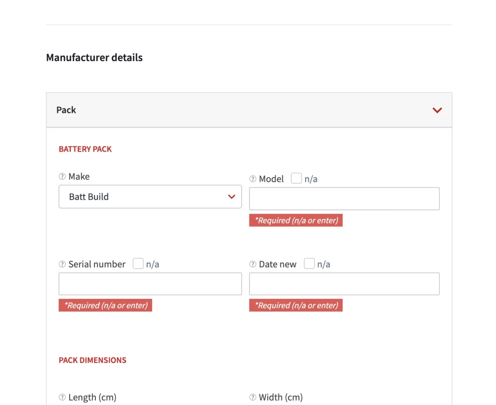
This was the main pain point for administrators. Since they proof the inspections after they are performed they are limited as to how they can update incorrect or missing data. Now that the fields only accept the proper type of data and have descriptive error messages it has greatly reduced the time it takes to review an inspection.
Problem 5
Not knowing when something is due, in progress or complete.
Solution: Let users know when an inspection is due, past due, saved, submitted or proofed. Buttons, graphics and messaging were used to indicate the state of the work being performed.
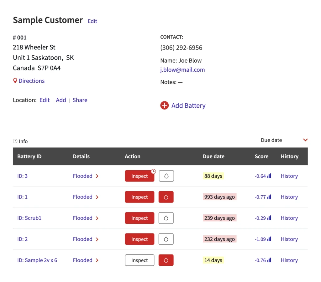
Buttons help indicate the state of an inspection.

Animated modals let the user know when a task is complete.
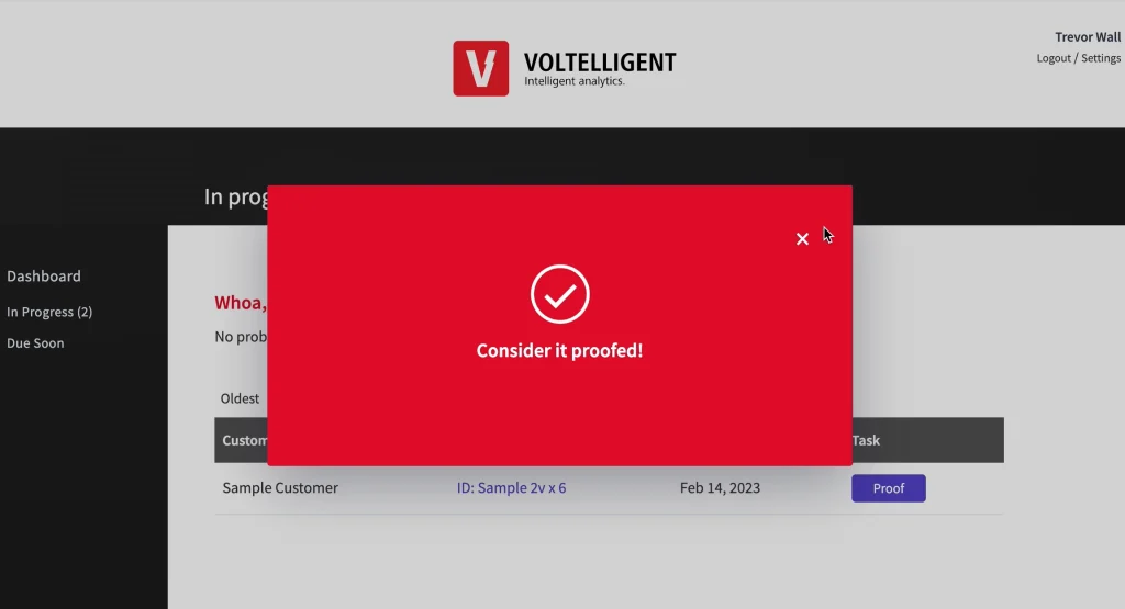
We also created ‘Due Soon’ and ‘In Progress’ pages. Quickly see all of the batteries with inspections that are in progress or due soon, helping schedule jobs more efficiently.
Problem 6
How to easily share the state of the battery with the customers that own them and battery manufacturers.
Solution: We initially created separate permissions for customers allowing limited access to the complete app. Testing showed customers did not have the time to login to view all of the details. They preferred an at-a-glance assessment that could be accessed with minimal effort on their part. We did this by creating a single page Assessment Report. A shareable link is auto-generated that allows one-click access to any battery’s report, and no login is required.
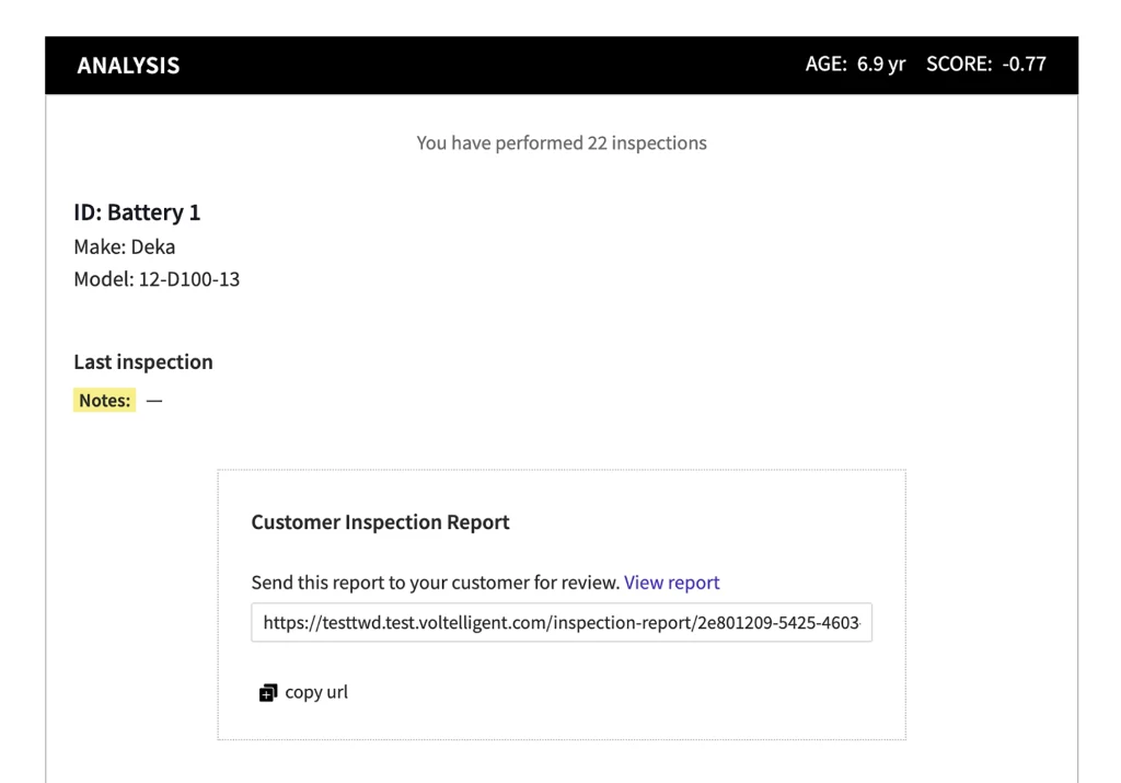
The report is one click away, no login required.
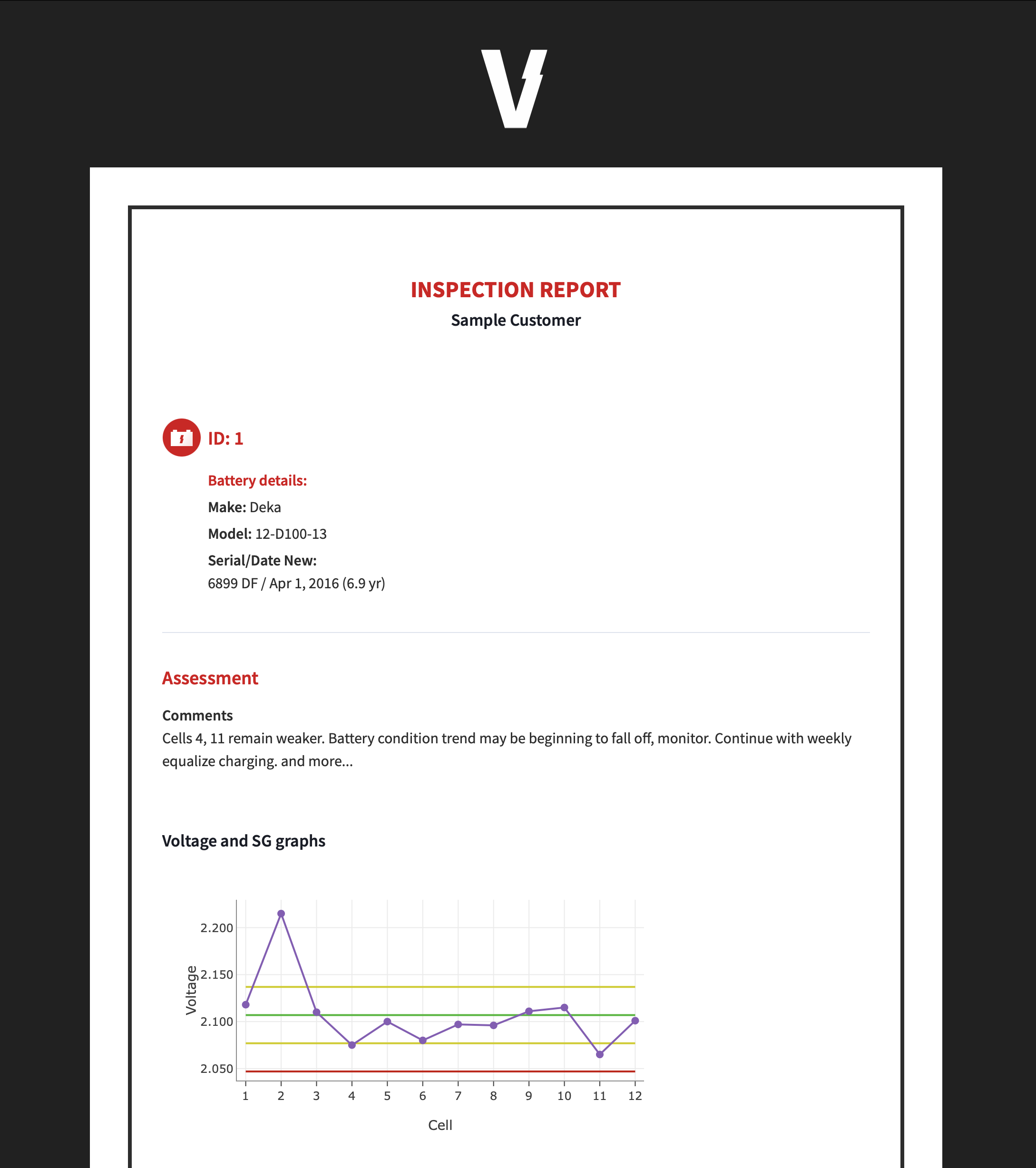
overview of features
Summary
This project was built by me and one other developer. Before we could build it we needed to understand the industry and how things worked so we could better understand our users. What are the conditions like, how do you physically access the batteries etc… From user stories, user flows, wireframes and prototypes I tried to get things as nailed down as I could before entering the development phase.